
How to Create a Cohesive Home Color Palette
Build a flexible, cohesive home color palette that connects every room while leaving space for personality, changing light, and practical everyday living.
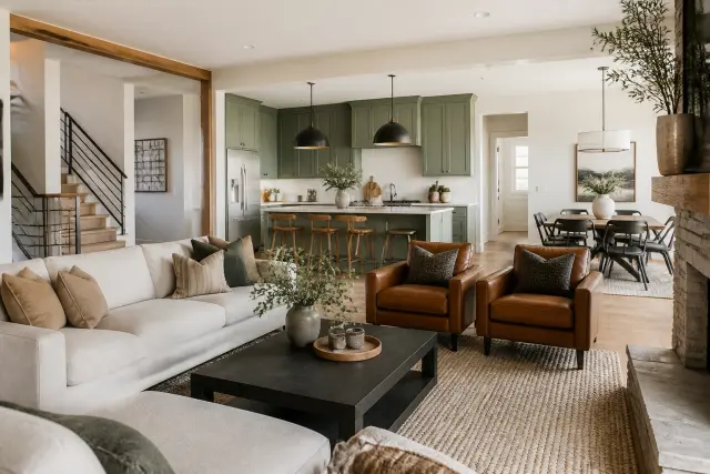
Introduction
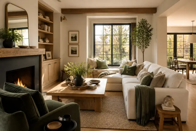
A cohesive home color palette is not a house where every wall is the same color. It is a repeatable system of related colors, materials, and contrast levels that makes rooms feel connected as you move through them. Done well, it creates a calm backdrop for daily life while allowing each room to have its own purpose and personality.
The easiest way to get there is to make fewer, more intentional color decisions. Start with the fixed elements you already own or cannot easily change, such as flooring, countertops, tile, cabinetry, brick, or a large sofa. Then choose a small set of colors that works with those elements in the actual light of your home—not just on a screen or a tiny paint chip.
This guide walks you through a practical whole-house process. You will learn how to define a color direction, account for undertones and light, assign colors to rooms, and use accents without making the result feel busy or overly matched.
1. Start With the Fixed Features of Your Home
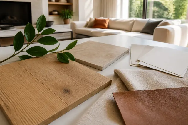
Before considering a trendy wall color, inventory the finishes that will remain in place for several years. Hardwood or luxury vinyl flooring, stone or laminate counters, fireplace surrounds, tile, cabinets, and roof- or brick-toned exterior views all influence what will look natural indoors. Photograph each area in daylight and gather samples when possible.
Look beyond the obvious base color. A beige tile may lean pink, gold, gray, or green; a white quartz counter may contain cool gray veining; and an oak floor can read orange, honey, or muted brown. These underlying color casts, often called undertones, do not have to match exactly. They do need to coexist without making one another look unexpectedly yellow, purple, or muddy.
Make a finish inventory
- Permanent finishes: floors, counters, tile, stone, cabinets, brick, and built-ins.
- Large replaceable pieces: sofas, rugs, dining chairs, headboards, and window treatments.
- Flexible layers: pillows, art, lampshades, flowers, books, and small decor.
Build your palette around the first group, coordinate the second group, and experiment most freely with the third. This order prevents a beautiful paint color from fighting the finishes that dominate the room.
2. Choose a Clear Color Direction
A color direction is the overall mood and temperature you want the home to convey. It could be warm and earthy, soft and coastal, classic and tailored, bright and airy, or deep and moody. Naming the direction is useful because it gives you a filter when several individually appealing choices compete for attention.
Choose a small working palette rather than a long list of favorite swatches. For many homes, that means one to three soft neutrals, one or two supporting colors, one deeper grounding color, and one optional accent. Neutrals can be creamy, taupe, greige, mushroom, charcoal, or warm white; “neutral” does not automatically mean cool gray.
Balance temperature and contrast
Most successful palettes have a dominant temperature, either warm or cool, plus a few intentional counterpoints. For example, a warm white, muted olive, caramel leather, and aged brass can coexist with a restrained charcoal accent. Also decide whether you want low, medium, or high contrast. Repeating the same contrast level from room to room often feels more cohesive than repeating the same exact hue.
3. Select a Whole-Home Base Neutral
Your base neutral is the color that appears most often, usually on main walls, connected hallways, open-plan areas, or trim. It does not have to cover every surface, but it should provide a dependable visual pause between more expressive rooms. A soft white or muted neutral is often easier to live with than a very stark white or a highly saturated beige.
Sample generously before committing. Paint large poster boards or use peel-and-stick samples, then place them vertically near the wall you plan to paint. View them in morning, afternoon, and evening light, and compare them directly with flooring, counters, upholstery, and trim. A sample that seems perfect in a store can shift dramatically at home.
Coordinate wall and trim colors
Using one trim color throughout the house is a simple unifying move. It may be a clean white, a softened white, or a color matched to existing trim. If you choose white walls and white trim, use samples together: two whites that look similar in isolation can reveal noticeably different yellow, pink, or blue casts when adjacent.
4. Learn to Read Undertones Before Buying Paint
Undertones are subtle, but they matter most when colors touch. A gray-blue paint can make warm beige carpeting appear more yellow, while a creamy white next to a cool white cabinet can look almost tan. Instead of asking whether a color is simply gray, white, or beige, ask what secondary hue appears when you hold it beside a true white sheet of paper.
Lighting changes the equation. North-facing rooms often receive cooler, softer daylight, while south-facing rooms tend to get warmer, brighter light. East-facing rooms are brightest and warmer earlier in the day; west-facing rooms often grow warmer later. Artificial bulbs can further alter the effect, so inspect samples after dark with the fixtures you actually use.
Use comparison, not guesswork
Place candidate samples side by side with your fixed finishes and with one another. Eliminate options that exaggerate an unwanted cast. If your floor has strong warm honey tones, you do not need a paint with the identical undertone, but an icy gray may create a sharper contrast than you intended. When the decision remains difficult, a local interior designer or color consultant can evaluate the entire set of finishes in person.
5. Plan Color Flow Through Connected Spaces
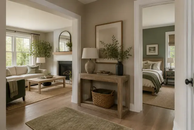
Stand in a doorway, hallway, or the center of an open floor plan and note the rooms visible at once. Those sightlines are where color transitions matter most. Adjacent rooms should share at least one bridge: a repeated neutral, related undertone, similar wood tone, recurring accent, or consistent trim color.
In an open-concept area, use fewer wall colors and create distinction through furnishings, rugs, lighting, or an accent wall that belongs to a defined zone. In a traditional layout with doors, you can use more variation, yet a repeating base neutral or accent family helps prevent every room from feeling like a separate decorating project.
- Repeat a wall color in a hallway, entry, or ceiling detail.
- Carry one metal finish or wood tone into nearby rooms.
- Echo a living-room accent color in art, textiles, or a small object in the dining room.
- Use a consistent floor tone or area-rug family where flooring changes are unavoidable.
6. Give Each Room a Role Within the Palette
Think of the home color palette as a cast of characters: the base neutral appears frequently, supporting colors appear in several rooms, and accent colors make selective, memorable appearances. Not every color needs to occur in every room. Repetition should be recognizable but not mechanical.
For example, a warm off-white may anchor the main spaces; sage may appear in a kitchen runner, guest-room bedding, and living-room pillows; and a deep navy may show up on a powder-room vanity, a front door, and a few framed prints. The repeat can be exact or tonal, such as forest green in one room and muted olive in another.
Match color intensity to the room’s purpose
Bedrooms often benefit from lower-contrast, restful combinations, while a dining room, powder room, or office can handle more drama. A dark paint color can be effective in a small room, but test it under nighttime lighting and consider ceiling height, available daylight, and how much visual weight surrounding surfaces already have. The right choice is about desired feeling, not room size alone.
7. Use Paint Finishes With Function in Mind
Color is only one part of a painted surface. Sheen changes how light reflects and how readily a wall can be cleaned. Flat or matte paint reduces glare and can disguise minor wall imperfections, but it may be less forgiving in busy areas depending on the product. Eggshell and satin are common choices for living spaces, halls, kitchens, baths, and children’s rooms because they offer more wipeability and subtle reflection.
Glossier finishes are often reserved for trim, doors, cabinets, and accents. Their reflectivity highlights both color and surface flaws, so careful prep matters. Review the paint manufacturer’s application and cure-time instructions before washing freshly painted walls or placing furniture tightly against them.
Prepare safely and thoroughly
Clean greasy or dusty surfaces, patch damage, sand as appropriate, and use a suitable primer when changing from dark to light, covering stains, or painting new drywall. In homes built before 1978, assume old paint may contain lead until it is tested. Avoid dry sanding or disturbing suspect paint yourself; use lead-safe practices and qualified professionals where needed. Provide ventilation, protect floors, and keep paint products and tools away from children and pets.
8. Add Texture, Pattern, and Material Contrast
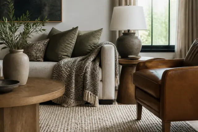
A cohesive palette can feel flat if every surface is smooth and every object matches. Texture lets you use closely related colors while maintaining depth. Consider linen drapes, wool rugs, woven baskets, ceramic lamps, natural wood, leather, stone, and matte metal. Their variations make a limited color story feel layered rather than sparse.
Patterns work best when they vary in scale and share part of the palette. You might pair a large-scale botanical curtain with a small geometric pillow and a subtle striped rug, provided they repeat a common neutral or accent. When a room feels overly busy, remove or simplify patterns before adding another color.
Let wood and metals participate
Wood is a color, not merely a material. You can mix wood finishes when they differ clearly in value or grain and are repeated intentionally. The same principle applies to metals: a primary finish can dominate while a secondary finish appears in a smaller, repeated role. Aim for a collected look, not a showroom set where every finish is identical.
9. Test the Palette in Real Light and Real Life
A palette is successful only if it works at the times and in the ways you use your home. Live with samples for several days. Open and close blinds, switch on lamps, and look at the colors beside seasonal outdoor views. A green that harmonizes with summer foliage may still need to work when winter light is cooler and the landscape is bare.
Evaluate practical wear, too. Light upholstery and painted cabinetry may be beautiful, but households with dogs, young children, frequent entertaining, or muddy weather may need washable finishes and forgiving patterns. Entryways and mudrooms benefit from colors and materials that conceal everyday scuffs without becoming so dark that the space feels gloomy.
Climate affects maintenance choices. In humid regions, promptly address moisture and use appropriately rated coatings in bathrooms or other damp areas; paint will not solve an active leak or ventilation problem. In dry, sunny climates, strong ultraviolet exposure can fade textiles near windows, so consider lined drapes, shades, or rotating sun-sensitive accessories.
10. Edit, Document, and Refresh Deliberately
Once the palette is in place, edit anything that competes with it. This does not mean discarding every mismatched possession. Group sentimental objects in a purposeful display, reframe art with a common mat or frame color, or move an outlying item to a room where it has more support. A cohesive home has visual breathing room.
Create a simple palette record for future decisions. Save labeled paint names and sheens, cabinet and flooring samples, fabric swatches, and photos taken in each room. Note which bulbs are installed in major fixtures. This record makes it much easier to replace a rug, touch up a wall, select bedding, or explain your color direction to a painter, contractor, or designer.
Know when to bring in professional help
Consult a qualified painter for large projects, damaged surfaces, high ceilings, detailed trim, or paint conditions that require specialized preparation. If renovations involve electrical work for new lighting, plumbing, structural changes, or altered egress, follow local permit and code requirements and hire appropriately licensed professionals. A designer can also help when multiple fixed finishes make the palette difficult to resolve.
Resist the urge to “finish” the palette with a last-minute burst of decor. Let rooms settle, then notice what is genuinely missing: perhaps a darker element for contrast, a softer textile, or one repeated accent. Small, considered changes are more likely to strengthen the system than an impulse purchase.
Remember that cohesion is flexible. Seasonal pillow covers, fresh flowers, and temporary art can change the mood without undoing the underlying structure. As long as the base colors, undertones, and material story remain consistent, your home can evolve gracefully over time.
Conclusion
Creating a cohesive home color palette starts with observation, not a paint deck. Identify your existing finishes, establish a clear color direction, choose a dependable base neutral, and test every important choice in the light of your own rooms. Then use repeated undertones, materials, and contrast levels to make transitions feel intentional.
Give yourself permission to build slowly. A well-connected home does not require matching furniture or identical paint in every space. It needs a thoughtful framework that supports your routines, the character of the house, and the things you genuinely enjoy living with.
Frequently Asked Questions
How many colors should be in a home color palette?
A practical whole-home palette often includes one to three neutrals, one or two supporting colors, a deeper grounding color, and an optional accent. You do not need to use every color in every room; repeating selected colors and undertones creates the connection.
Do all rooms in a house need to have the same wall color?
No. A shared wall color can simplify open areas and hallways, but separate rooms can have different colors. Connect them with a common trim color, related undertones, repeated textiles, wood tones, or accent colors visible across nearby spaces.
How do I know whether a paint color has a warm or cool undertone?
Compare the sample against a clean white sheet of paper and against your fixed finishes. Warm undertones may read yellow, red, orange, or pink; cool undertones may read blue, green, or violet. Always check samples in daylight and under your evening lighting.
What is the best way to test paint colors at home?
Use large painted sample boards or peel-and-stick samples placed vertically around the room. Review them at different times of day and next to floors, counters, cabinets, fabrics, and trim. Avoid choosing from a small chip under store lighting alone.
Can I mix warm and cool colors in the same home?
Yes. Choose one overall temperature direction, then add limited contrast deliberately. For instance, a mostly warm palette can include charcoal or blue-gray accents if those cooler notes are repeated and work with the home's major finishes.
How can I make an open floor plan feel cohesive without making it boring?
Keep the main wall color and major undertones consistent, then define functional zones with rugs, upholstery, lighting, art, texture, and controlled accent colors. This gives each area identity without creating abrupt visual breaks.